Tizzy Talk
»
The Books
»
Announcements
»
Into the Abyss 2nd Edition Cover Sneak Peak
Rank: Arch Demon
Groups: Administrators, AoD Beta Demon, ITN Beta Demons, Registered, Registered Users, Subscribers
Joined: 3/14/2014(UTC)
Posts: 1,986
Thanks: 174 times
Was thanked: 109 time(s) in 86 post(s)
|
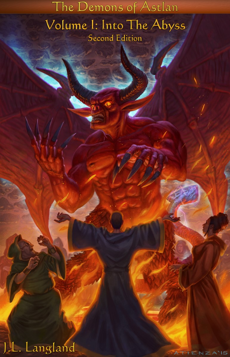
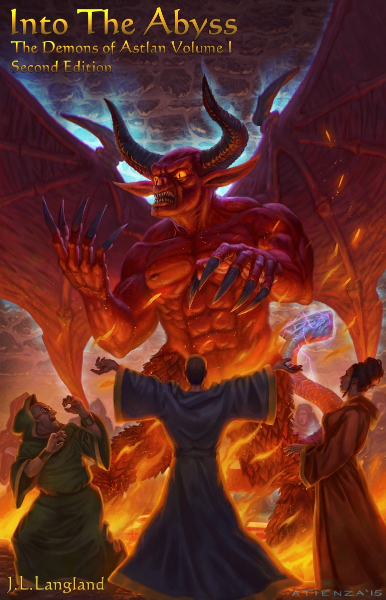
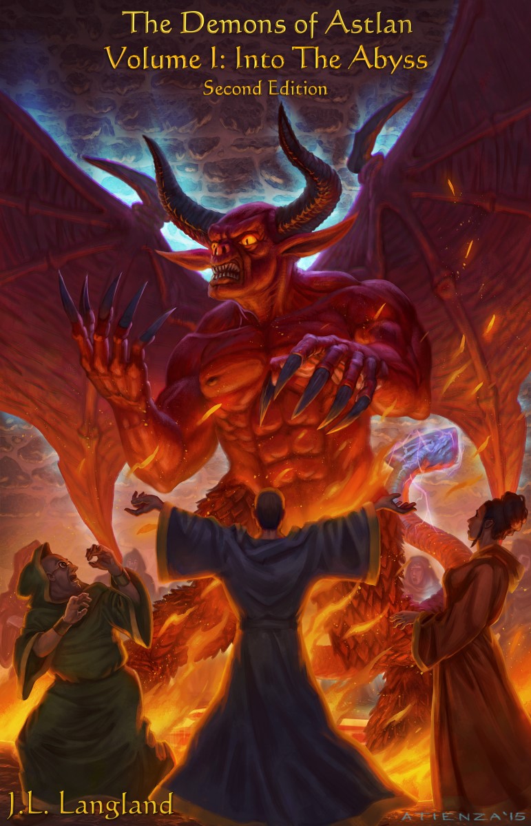
The Second Edition is coming next week! Main time constraint is the Dead Tree Format and Galley process.... Here is a sneak peak at the new cover  Image is by Jacob Atienza or jubjubjediThe image is set, the text and bar at top can be changed/rearranged if people have suggestions. Here is a second version  Update 6/7 Here is a no bar at the top edition  Edited by user Monday, June 8, 2015 12:18:27 AM(UTC)
| Reason: Not specified
|
|
|
|
|
|
Rank: Sprite
Groups: AoD Beta Demon, Beta Demon, Heavenly Host Beta Demons, Registered, Registered Users, Subscribers
Joined: 5/17/2014(UTC)
Posts: 30
Thanks: 2 times
Was thanked: 1 time(s) in 1 post(s)
|
I'd go with the top one for the text
|
|
|
|
|
|
Rank: Sprite
Groups: AoD Beta Demon, Beta Demon, Heavenly Host Beta Demons, Registered, Registered Users, Subscribers
Joined: 5/30/2015(UTC)
Posts: 39
Thanks: 1 times
|
I agree with Anskier. Your book description to book two on goodreads coincides with the one in Into the Abyss. Edited by user Sunday, May 31, 2015 8:06:13 AM(UTC)
| Reason: Not specified
|
|
|
|
|
|
Rank: Greater Demon
Groups: Beta Demon, Heavenly Host Beta Demons, Registered, Registered Users, Subscribers
Joined: 6/19/2014(UTC)
Posts: 468
Was thanked: 6 time(s) in 6 post(s)
|
I like the top one.
By the way. Beautiful illustrations. Like to restart my fan art. Thanks.
|
|
|
|
|
|
Rank: Arch Demon
Groups: Administrators, AoD Beta Demon, Heavenly Host Beta Demons, ITN Beta Demons, Registered, Registered Users, Subscribers
Joined: 3/14/2014(UTC)
Posts: 1,973
Thanks: 3 times
Was thanked: 47 time(s) in 44 post(s)
|
That's where I've been leaning. In theory the titling can be never ending...going through a billion fonts/sizes/placements/material effects... Be sure to check out some of his other works at jubjubjedi.deviantart.com
|
|
|
|
|
|
Rank: Greater Demon
Groups: Beta Demon, Heavenly Host Beta Demons, Registered, Registered Users, Subscribers
Joined: 6/19/2014(UTC)
Posts: 468
Was thanked: 6 time(s) in 6 post(s)
|
The works on the deviantart seems to be of a different in style compared to the book cover art. Is this intensional? Edited by user Tuesday, June 2, 2015 8:07:14 AM(UTC)
| Reason: Not specified
|
|
|
|
|
|
Rank: Arch Demon
Groups: Administrators, AoD Beta Demon, Heavenly Host Beta Demons, ITN Beta Demons, Registered, Registered Users, Subscribers
Joined: 3/14/2014(UTC)
Posts: 1,973
Thanks: 3 times
Was thanked: 47 time(s) in 44 post(s)
|
I suppose to some extent. He actually has a fairly wide set of styles. Initially we were thinking first generation of covers for the Myth Adventure books (the slightly more classic style than the zanier later books) But then through discussions just sort of came around to this. Here is one he did that is very different in style from most of his other works http://jubjubjedi.deviantart.com/art/Mystical-Owl-505879218I think this one is closer in style to the cover we ended up with http://jubjubjedi.deviantart.com/art/The-Summoning-259359296We spent quite a bit of time discussing Tom and ended up going with something like Zodd the Immortal He took the three wizards from my images on the site. I was very surprised/pleased with those, they look very classic fantasy ala Darrell K Sweet, Rowena, etc.
|
|
|
|
|
|
Rank: Greater Demon
Groups: Beta Demon, Heavenly Host Beta Demons, Registered, Registered Users, Subscribers
Joined: 6/19/2014(UTC)
Posts: 468
Was thanked: 6 time(s) in 6 post(s)
|
There is still marked difference, though I think it is because the book art is less polished compared to the work in the deviantart page. More sketchy.
|
|
|
|
|
|
Rank: Arch Demon
Groups: Administrators, AoD Beta Demon, Heavenly Host Beta Demons, ITN Beta Demons, Registered, Registered Users, Subscribers
Joined: 3/14/2014(UTC)
Posts: 1,973
Thanks: 3 times
Was thanked: 47 time(s) in 44 post(s)
|
Hmm,
I don't quite see that, if anything I think I like it better than some of the deviant art stuff.
Also, one thing I did notice is, and it's a bit of a concern, is that the book cover gets a lot better when it's blown up to full size.
The real image is very large, this is a shrunk version and what most people will see in the book store is shrunk smaller yet.
But if you take it to full screen size it does, in my eye, get better.
Once released there will be a bigger version on the site. Also if you click on the image in this topic you'll see a somewhat bigger version.
|
|
|
|
|
|
Rank: Arch Demon
Groups: Administrators, AoD Beta Demon, Heavenly Host Beta Demons, ITN Beta Demons, Registered, Registered Users, Subscribers
Joined: 3/14/2014(UTC)
Posts: 1,973
Thanks: 3 times
Was thanked: 47 time(s) in 44 post(s)
|
Looking at again, I may be differently interpreting what you mean by polish and sketchy.
This image is a bit more detailed than some of the deviant art. And in particular, Tom is drawn with a lot more heavy lines, and is less flowing/fluid than some of his other stuff. This is intentional to give a more gut level fear quality I guess you'd call it.
|
|
|
|
|
|
Rank: Sprite
Groups: AoD Beta Demon, Beta Demon, Heavenly Host Beta Demons, Registered, Registered Users, Subscribers
Joined: 5/17/2014(UTC)
Posts: 30
Thanks: 2 times
Was thanked: 1 time(s) in 1 post(s)
|
For the image - Why is he looking over to the left? He is facing and pointing forward toward the other people, but looking off to the left apparently at nothing. That seems odd to me Edited by user Tuesday, June 2, 2015 8:10:36 PM(UTC)
| Reason: Not specified
|
|
|
|
|
|
Rank: Arch Demon
Groups: Administrators, AoD Beta Demon, ITN Beta Demons, Registered, Registered Users, Subscribers
Joined: 3/14/2014(UTC)
Posts: 1,986
Thanks: 174 times
Was thanked: 109 time(s) in 86 post(s)
|
Ha! It's not just me! I asked the same question when I first saw it and asked, shouldn't he be looking at Lenamare or one of the wizards?
What Tom is supposed to be doing is looking at his hand/claws in terror/fascination. The blue glow is the magic of first formation/materialization.
We went back and forth on the blue light of materialization. If we hadn't done the light, I'd have had the artist draw him looking at Lenamare or Trisfelt.
However, I decided I wanted to keep the blue light since as you shrink the cover it helps Tom stand out as the stones get rather dark towards the top.
So I then decided to keep him looking at his hand/claws because as he forms he's going to be in shock. That's also the expression on his face.
It makes sense, once you know, I think. But wondering if it will be too distracting. Although, I've heard enough about distracting positions/proportions from the first cover that I'm hoping it's still a step up in terms of less weirdness to the first time viewer.
|
|
|
|
|
|
Rank: Greater Demon
Groups: Beta Demon, Heavenly Host Beta Demons, Registered, Registered Users, Subscribers
Joined: 6/19/2014(UTC)
Posts: 468
Was thanked: 6 time(s) in 6 post(s)
|
@Tizzy Well, sketchy isn't the appropriate term, it should be painterly. Nothing is wrong with a painterly style and many artist like working in painterly styles. To see what I mean look at this work: http://jubjubjedi.devian...geon-Explorers-521022888Notice how much more attention is given to the hair on the characters compared to the book cover art. And this: http://jubjubjedi.devian...0-000-Conquest-496841704Notice the more defined folds on the fabric and more care given on the shading. But then, this is his portfolio and artist often display their best work there. @Anskier That is what I was asking at first seing it. I just then assumed that he was looking at himself (hand), though Tom should have his head tilted lower. @The Author Guy I think Lenamare is more distracting. His blue clothing is a large area of cool color among the mostly warm color of the whole image. His bold pose and some elements like Tom's left claw and Jehena's hand point directly at him and directs your attention at him.
|
|
|
|
|
|
Rank: Arch Demon
Groups: Administrators, AoD Beta Demon, ITN Beta Demons, Registered, Registered Users, Subscribers
Joined: 3/14/2014(UTC)
Posts: 1,986
Thanks: 174 times
Was thanked: 109 time(s) in 86 post(s)
|
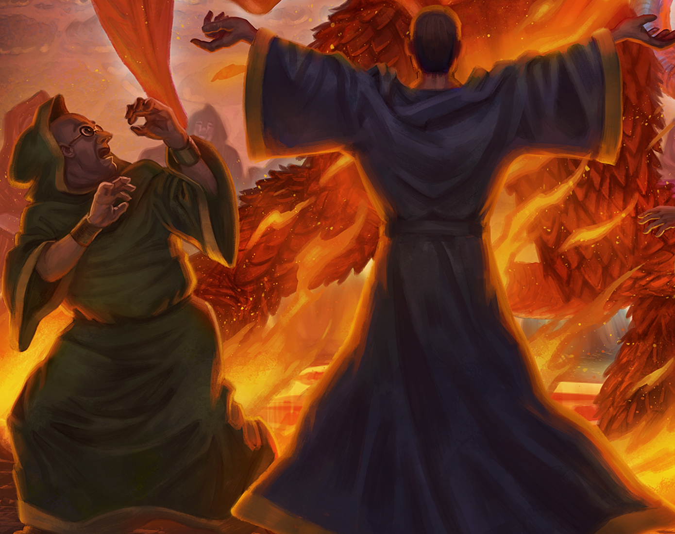
As far as Lenamare drawing too much attention? I'm sorry, I thought you met the man in book 1? That is sort of who he is! I would not be surprised if he wasn't sending the artist instructions on the side! It sounds like something he would demand of any image with him in it. As far as attention to detail...I think it's there, but there is an issue of a) size and b) lighting/shadow. Here is a full size (scaled down for forum) clip of Triseflet and Lenamre. I can see Lenamare's hair and robe folds. But also remember the idea is to have less detail on non-major characters, so Tom gets the most detail. Look at his scales. Download (or just click on) this image and open it it is like 1390x1100. The stupid forum software is setting max width and height to be 500 and I can't figure out how to override that code. 
|
|
|
|
|
|
Rank: Greater Demon
Groups: Beta Demon, Heavenly Host Beta Demons, Registered, Registered Users, Subscribers
Joined: 6/19/2014(UTC)
Posts: 468
Was thanked: 6 time(s) in 6 post(s)
|
We are talking about the cover. His figure just cut a stong impression.
So it was intentional. Still, even with less definition, he still stands out. He cut a bold shape in the front.
|
|
|
|
|
|
Rank: Arch Demon
Groups: Administrators, AoD Beta Demon, ITN Beta Demons, Registered, Registered Users, Subscribers
Joined: 3/14/2014(UTC)
Posts: 1,986
Thanks: 174 times
Was thanked: 109 time(s) in 86 post(s)
|
He will be gratified by your comments!
And his commanding presence is to a point very intentional. The summoning is a battle of two egos, Tom and Lenamare. Refer back to Edwyrd and Lenamare at dinner. This confrontation between the two is something that haunts both of them. You will see this come back again in book ii.
The demon is raw overwhelming power. But the wizard, a mere mortal, by use of his knowledge and will power can control, dominate and bind this giant monster.
We were really trying to get to 'old school demon summoning' in which the wizard is the hero, not the demon.
|
|
|
|
|
|
Rank: Shadow
Groups: Heavenly Host Beta Demons, Registered, Registered Users, Subscribers
Joined: 6/5/2015(UTC)
Posts: 3
|
I also prefer the text from the first edition, though otherwise the second edition is better (the orange bar at the top in the first is unnecessary). The only concern with the first edition is the text size might be a little small when viewed on thumbnails, so personally I'd go with the background of the second, the text placement and style of the first, and then just increase the text size a little.
But either way, they're much better than the original cover of the book - very nice!
|
|
|
|
|
|
Rank: Shadow
Groups: Heavenly Host Beta Demons, Registered, Registered Users, Subscribers
Joined: 6/5/2015(UTC)
Posts: 3
|
Double post, sorry. Website is a little slow and I clicked "post" twice :(. Edited by user Friday, June 5, 2015 8:51:14 PM(UTC)
| Reason: Double post.
|
|
|
|
|
|
Rank: Arch Demon
Groups: Administrators, AoD Beta Demon, ITN Beta Demons, Registered, Registered Users, Subscribers
Joined: 3/14/2014(UTC)
Posts: 1,986
Thanks: 174 times
Was thanked: 109 time(s) in 86 post(s)
|
That's the key point I "want" to hear.
My dread is that have spent the money on an actual artist for the cover, everyone will go. "Oh, the first was so much better, you shouldn't have wasted the money!"
|
|
|
|
|
|
Rank: Imp
Groups: AoD Beta Demon, Heavenly Host Beta Demons, Registered, Registered Users, Subscribers
Joined: 6/13/2014(UTC)
Posts: 50
Thanks: 15 times
|
Originally Posted by: The Author Guy  That's the key point I "want" to hear.
My dread is that have spent the money on an actual artist for the cover, everyone will go. "Oh, the first was so much better, you shouldn't have wasted the money!" There's a joke art of your cover I think from someguy that does spoofs on book art, for the life of me I can't remember where I saw it but it made me chuckle. Tom had a really silly look on his face. Hmm I am going to feel silly if it wa from here.. But I shall hit post anyways! Wanted to add your cover art is what cought my eye and made me stop to buy the book. It was original. Edited by user Sunday, June 7, 2015 3:56:06 PM(UTC)
| Reason: Not specified
|
|
|
|
|
|
Tizzy Talk
»
The Books
»
Announcements
»
Into the Abyss 2nd Edition Cover Sneak Peak
Forum Jump
You cannot post new topics in this forum.
You cannot reply to topics in this forum.
You cannot delete your posts in this forum.
You cannot edit your posts in this forum.
You cannot create polls in this forum.
You cannot vote in polls in this forum.